Color plays a vitally important role in the world in which we live. They can sway thinking, change actions, and cause reactions. They communicate deeply, in a silent language. They can irritate or soothe your eyes, raise or suppress your appetite. When used in the right ways, they even save on energy consumption.
It is hard to imagine a life without colors. Everyone appreciates colors a little differently, different shades, different tones, and hues. Colors are used differently to design and bring out aesthetics out of anything. Collection of different colors makes thematic outcomes which adds on a lot of glamour, style, class or pleasing sight to almost anything.
Colors are used to organize life and bring order also, like stop lights, or yellow versus white directional stripes on the road, or like when some very organized people color code everything from documents or books to kitchen pantry or Tupperware. Colors have a very high importance when it is about designing a house, whether we talk about its interior or exterior, walls floors or furniture. A color scheme can make or break an interior design.
Color schemes are especially important in the kitchen. The colors you choose for your appliances, cabinets, countertops, and walls will determine how your kitchens looks or ambience will come out. Warm tones, like red, orange and yellow can energize a space and its occupants. Cool tones such as blue, green and purple generally create quiet, relaxing atmospheres. When choosing them, it’s important to keep the goal of the space in mind. What you actually wish your kitchen to look like at the end, how your overall home interior is and kitchen theme will intermingle with overall theme of your house.
Kitchen colors can unify the entire aesthetic of a kitchen’s design and structure, bringing some much-needed pop, vibrancy and liveliness to the area. A livelier kitchen can also make for a more engaging cooking and eating area.
Hence, we shall not ignore the fact that color is a vital tool, which shall be considered very important when designing the elements of a kitchen design. Just ignoring this fact, or overlooking selection if right colors combination, can ruin the whole effort done to make a dream kitchen and vice versa.
What is a Color Wheel?
Before starting a discussion about color schemes of kitchen interior, let’s just have a look on what is a basic color wheel. Several kinds of color wheels are in use, but most of them are based on the traditional RYB color wheel – red, yellow, blue.
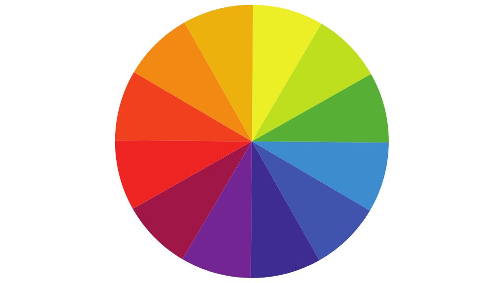
Mixing these primary colors can give you other secondary colors like green, orange, and purple etc. Furthermore, if you mix the primary and secondary colors, you get tertiary colors like magenta or bottle green etc. So, you go on making different colors.
Let’s see a few important factors that define a color.
1. Hue
Twelve colors at their highest chroma and most pure state, defines the hue of a color. A color’s value changes by changing its tint, tone, or shade.
2. Tint
The lighter value of a color created when a hue is blended with white is called a tint. It can be any ratio mixed with white and hence we can bring out several tints a of a single-color hue and every one will give a different experience. Most of the color creates its coolness or brightness.
3. Tone
A tone of a color is created when a hue is blended with gray, giving several shades in the same way. Tone is the quietness of the color.
4. Shade
A shade is a darker value of a color, made by adding black. Just as with the tints and tones, a hue may be mixed with just a touch of black or with so much black that you are hardly able to detect the hue; all are considered a shade of the hue. shades are the richness of a color.
While there are several kinds of color palettes that you can make this way and then use them to create your own color scheme, these four main standard types. So, let’s have a look at them first.
1. Monochromatic
If you like keeping things plain and simple, you should go for the monochromatic color palettes as they consist of the same hue in different shades, tints and tones.
The plus side is that since you are dealing in the same color, the chances of disasters are relatively minimal. However, keep in mind that it can often become way too plain and boring too, having a single color throughout.
It would be best if you went for this color palette when working with a corporate color that probably doesn’t like to mix up a lot of colors, e.g., white monochromatic kitchens or natural wood shades monochromatic kitchens are evergreen trends.
2. Analogous
These color palettes are quite fun and straightforward to create. You have to pick the primary color of your choice and then pick automatic grouping hues around it from the color wheel.
Chances of a disaster is relatively low in it as color wheel is a standard system.
3. Complementary
If you like to keep things balanced and maintain order, you should pick out a complementary color palette. It consists of opposite colors in the color wheel. For instance, red and green.
These palettes get the immediate attention because of their vibrant mixing nature. If chosen wisely, such pellets give a very designer kind of, expensive, unique and glamorous look.
4. Triadic Color Palettes
If you genuinely want to create something remarkable, then choose a triadic color palette. These palettes are made from three colors at equidistant points. For instance, red, yellow, and blue.
This is where you go gaga over the colors and come up with an exceptional and lasting palette. However, keep in mind that you’d have to do a lot of experimentation and sampling to get the right colors and their variants together. Chances of disasters are high in this case, but having the particular knowledge and experience helps doing this job easily.
We, IND Construction are very particular about color schemes about any part of your house design, specifically kitchen. We have a team of experts who would suggest you the right combinations and choices according to your likes dislikes and then deliver you the committed task making sure the quality.
Every kitchen we have ever made for our prestigious clients, is a memorable task we did. We will surely give you a very personalized experience you will remember for a life time.
Here are some special mixed blends of our own about various color schemes you can choose for your kitchen. You can also discuss about a new mix we can create as per your choice. These are just a collection of some:
Single Color Kitchens
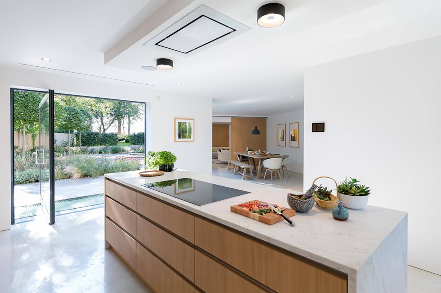
Single color or monochromatic kitchens are always in fashion. They can be chosen in some very selective colors like white, faun, brown, black. Sometimes red is also the choice but it is a rare one. Natural wood colors are the best choice for such kitchens. Choosing a perfect hue for a monochromatic kitchen which goes blended with your overall house theme is critical, and then selecting that hue in its perfect tint, tone, and shade is an expert’s job. A well selected color will bring a marvelous kitchen design.
Multi Color Kitchens
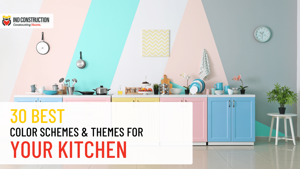
Mixing colors, making your own pellet, selecting 2, 3 or 4 colors and designing a kitchen is an expert’s job. One or two colors can be given to the cabinets and a well blending or contrast color can be chosen for the counter top. A neutralizing color shall be given to walls and ceilings and a spicing up color shall be chosen for the floor. Sometimes a highlighter color breaking the monotony helps give your kitchen get an out of the box look. Here are some preformed color pallets you can choose from:
1. A Mix of Eagle, Sahara Sand, Heavy Metal and Masala.

2. A Mix of Bismark, Athens Grey, Tussock and Leather.

3. A Mix of Wood Smoke, Squirrel, Pampas, Sandstone.

4. A Mix of Dune, Alabaster, Scarlet, Boulder.

5. A Mix of Kimberly, Mystic, Manatee, Brandy Rose.

6. A Mix of Quill Grey, Tuscany, Iron, Coffee.

7. A Mix of Carrot, River Bed, Cararra, Venice blue.

8. A Mix of Ebony Clay, Barley, Mercury, Oslo Grey.

9. A Mix of Cherry Wood, Lace, Goldenrod, Charcoal.

10. A Mix of Olive, Cumin, Wisp, Pueblo.

11. A Mix of Silver, Copperfield, Gallery, Dusty Rose.

12. A Mix of Shark, Driftwood, Bone, Fuscous Grey.

13. A Mix of Fawn, Porcelain, Dawn, Teak.

14. A Mix of Kangaroo, Burnt Sienna, Ebb, Edward.

15. A Mix of Bermuda, Ghost, Iron, Tumbleweed.

16. A Mix of Iron Stone, Polar, Glade Green, Pale Slate.

17. A mix of Silver Sand, Athens Grey, Loblolly, Shark.

18. A Mix of Lemongrass, Cloud, Soy Bean, Charade.

19. A Mix of Calypso, Frost, Copper Rust, Breaker Bay.

20. A Mix of Dessert, Swiss Coffee, Red Damask, Heather.

21. A Mix of Piper, Merino, Clamshell, Tango.

22. A Mix of Twilight, Rust, Prim, Eggplant.

23. A Mix of Mongoose, Blush, Juniper, Stromboli.

24. A Mix of Avocado, Pueblo, Calico, Cinnamon.

25. A Mix of Cosmos, Ice, Potpourri, Cape Honey.

26. A Mix of Mango, Snow Drift, Schooner, Wood Smoke.

27. A Mix of Hurricane, Vulcan, Moon Mist, Kabul.

28. A Mix of Leather, Spring Wood, Oslo Grey, Corduroy.

29. A Mix of Spring Leaves, Sienna, Gondola, Monarch.

30. A Mix of Wood Smoke, Swirl, Cotton Seed, Tuna.

These are some premade color pallets to give you an idea of combinations. Several color pallets can be made using a color wheel and basic rules of mixing colors. Please visit our office or website for the color combo choices for your dream kitchen.
Our expert team is always ready to serve you the best service in town.
A good color scheme brings out a vibrantly speaking kitchen in its own tone. Choose your color wisely!
